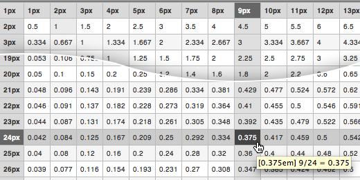
Converting pixels to EMs can be a pain so I created the EmChart pixels to EMs lookup table. I’ve been using it for several months and have been relying on it quite heavily. So finally getting around to posting it here.

Using a relative unit such as EM is a great way to maintain the vertical rhythm of a web page when a user resizes text in their browser. But constantly reaching for a calculator to compute the correct EM value to use every time you need to is also a great way to drive yourself mad.
Let’s say you have an H3 that’s 24 pixels. It doesn’t matter how the font-size is set (pixels, EMs, percentages, etc). You can check the actual font-size in pixels using Firebug by checking “Show Computed Style” in the Options menu in the upper right corner of the CSS/Style panel while viewing in HTML mode.
You’ve checked the design comp and measured exactly 9 pixels of bottom margin under the H3 until the next element. Of course you can set the bottom-margin of the H3 to 9 pixels and move on. But that won’t scale when a user bumps up their text size in their browser and your vertical rhythm will crumble as the H3 grows in size but keeps the same 9 pixels of bottom margin.
The Formula
The formula for computing the EM multiplier is:
desired pixel size ÷ current pixel size = multiplier
So for the H3 example: 9 ÷ 24 = 0.375
The Chart
It’s a handy formula to memorize, but it’s still lame to punch it into a calculator dozens of times a day. I figured it couldn’t be too hard to loop through the formula in PHP or JavaScript to create a lookup chart. So I whipped it up in PHP then later changed it to JavaScript to keep it more portable. The EmChart places desired pixel size in the columns, and current pixel size in the rows.
Everyday Usage
I use the EmChart all the time when converting design comps to HTML/CSS templates – which is basically all day every day. I find it very useful for calculating bottom margins, line-heights (which are unitless, but the formula still applies), top margins, and top/bottom padding among other things. It’s also really handy for keeping nested relative font-sizes straight. The CSS and JavaScript is all included within the HTML page to keep it portable. I actually launch it as a standalone application using Fluid (Mac). Feel free to copy the source and use it as you’d like. But get in touch if you make any derivatives.
As I mentioned, it doesn’t matter how your current font-size is set. So this will work for you regardless of what font-size or unit is (or isn’t) set on the HTML element, BODY element, or any other element. You just need to know the effective pixel size of the current element you’re working with.
Credits
EmChart is enhanced by (but can be used without) the Unobtrusive Table Actions Script by Brian McAllister.